
03 Apr Online warehouse heatmap visualizes pick activity
Where does activity concentrate in the warehouse and where is there little movement? Warehouses have plenty of data, but often lack insight. A heatmap of your warehouse makes it immediately clear where bottlenecks exist.
But how do you create such a visualization?
- Which locations are visited most frequently?
- Are they at the front or in the back?
- Where do congestion points arise?
- And where is inventory gathering dust?
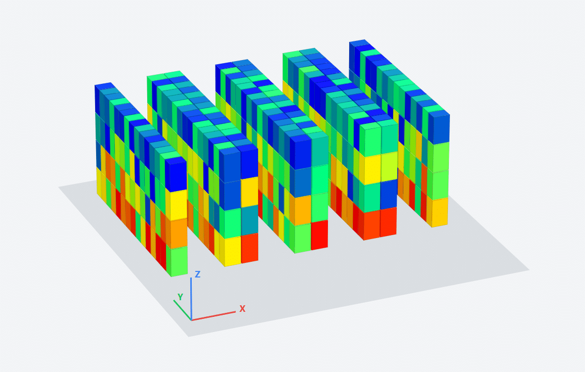
Excel and Power BI get stuck in flat 2D representations. Simulation software can do it, but that’s overkill.
That’s why we’re introducing the Metrica Warehouse Heatmap. The heatmap shows the entire warehouse at a glance. Busy locations turn red, quiet locations blue. You see where the pressure is and where it isn’t.
This leads to unexpected insights. Early users found that fast-mover zones were intensively used, but at the same time that A-locations within them hadn’t been touched for months. That enables targeted improvements.
Try it yourself via the link above. Upload your data and generate 2D and 3D visualizations of pick activity in your warehouse. Completely online. No account needed. Data is only used during the session and not stored. Privacy by design.
Let us know if you’ve tried the heatmap. We’re curious about your findings.
The warehouse heatmap is part of the Metrica Warehouse Optimization System.
About the author
Jeroen van den Berg is the author of Highly Competitive Warehouse Management and holds a PhD in warehouse algorithms from the University of Twente. He has been advising companies on warehouse optimization and WMS since 1997, running his own consultancy since 2001. He develops Metrica, a Warehouse Optimization System.
Sorry, the comment form is closed at this time.